When We Design Cities for the Extremes, Everyone Benefits
July 16, 2018 — Blog
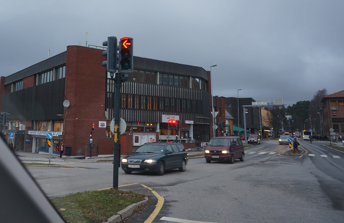
I was driving over the Kongsvinger bridge on the way to Oslo when a municipal traffic signal tried to kill me. The traffic signal pictured below intends to tell drivers when it’s not safe to turn left. But for folks like me who live with a color deficit, it actually urges me to turn left into oncoming traffic. “Turn left now!” it shouts, with impatient other drivers on my tail urging me to act quickly.

Even if you’re not colorblind, the part of your brain that interprets the encouraging left-pointing arrow fires a hundred or so milliseconds before the part that interprets colour = red = danger = don’t turn left! The resulting cognitive dissonance (and unnecessary cognitive load) is a burden for all, while potentially tragic for many.
The largest cause of accidental death in cities worldwide are traffic accidents; the majority of these at intersections. The cost isn’t just in human life and misery: accidental death, injury, and destruction is enormously costly to city governments.
And indeed, when we design for the extremes, and we do it well, everyone benefits.
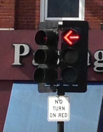
These signs are not unique to Norway: I’m sharing a photo of a similar traffic signal in downtown Cambridge, Massachusetts. It includes an equally unhelpful “NO TURN ON RED” sign.

The state of Massachusetts’ solution is to forbid colorblind people from having drivers’ licenses.
There’s no question that the revolution in information communications technology offers so many better ways to not just solve such problems, but also make for better living in our cities. Sensors, smart grids, and virtual reality augmentation of physical spaces provide a myriad of opportunities to cleverly route our pedestrians, cyclists, and drivers through our shared spaces in a way that minimizes collisions and barriers. Indeed, traffic signals and road signs will go the way of the typewriter altogether soon enough. But in the intervening generation, we’ll need intuitive, legacy solutions.
The sustainable solution to traffic signals? I’ll circle back to that. However first, let’s level-set our goals.
When we think of disabilities, most tend to think about the extremes: someone blind since birth… someone living with quadriplegia… being completely deaf. Yet most disabilities are more subtle, more temporary. Indeed, most people experience disability or impairment.
Are any of these true for you?
- Do you have any sort of visual impairment?
- Are you colorblind?
- Do you wear glasses?
- Have you had laser eye surgery?
- In a wheelchair?
- Are you Deaf?
- Hard of hearing?
- Taking medicine for a cold or allergies?
- Is English not the first language you learned?
- Left-handed?
- Have you ever had a limb in a cast for more than two days?
- Carpal tunnel syndrome?
- ADD? ADHD? (Already bored with my list?)
And that’s not counting temporary deficits: when you’re on the treadmill at the gym where five TVs are showing five stations: the sound is turned off and the captions are on, and so everyone is temporarily deaf. Or when we use a black and white laser printer to print a webpage: almost all suffer from that flavour of temporary color blindness.
The truth is most of us have some sort of substantial impairment, while anyone is temporarily disabled when we’re standing on the bus, holding a bag of groceries in one hand and trying to text on our smartphone with the other.
So if we want everyone to be able to enjoy every aspect of our cities, inclusive design simply makes sense.
An accessible city helps everyone
When we design for the extremes, everyone benefits. You may not need the cuts in the sidewalks that allow wheelchairs to cross intersections easily but you sure enjoy them when you’re towing a suitcase or stroller.
People are often concerned that if they follow the accessibility principles, whether for the built environment or digital accessibility, there will be a trade-off of good user experience for their mainstream residents or visitors. And indeed if you don’t understand why the international standards and techniques exist, there is that possibility. However if you take the time to understand the thinking behind the guidelines, you can implement without tradeoffs … and most often with benefits for all: so that everyone is not just accommodated but delighted when navigating and interacting in the way that works best for them.
Accessible infrastructure gives cities a competitive edge
Very few foresaw that curb cuts would lead to wheeled suitcases and better bicycles. Or that automatic doors delight parents with strollers. Or that announced stops on transit systems help everyone who can hear. Municipalities that embrace universal design principles spend far less time and money by building in accessibility from the start, compared to those that struggle with retrofits.
That measure of future-proofing alone could be your business case to follow accessibility guidelines and innovation. But there’s more… Municipalities that embrace accessibility attract a broader range of workers, as well as a broader range of aging tourists with substantial disposable income.
And a city with inclusive navigation and information systems gains savings on call centers when more citizens can self-serve online. A typical call to a call center costs perhaps $25 to fulfill. A self-served help incident on a website instead costs perhaps five cents. Every time a visitor can self-serve, municipal governments with a “digital first” ethic gain their accessibility dividend.
Accessibility regulations and standards are here now
If no other argument moves you, the risk of being at the wrong end of liability lawsuits increases as inclusive design becomes the law in more and more jurisdictions and situations.
So why wait to be pushed into it by the threat of legal action? Get ahead of the curve, and start impressing everyone while driving down costs… you may even sleep better at night. Because it’s just another opportunity to not just do good design, but to do good.
Back to traffic signals
So while it’s fun to talk about where smart cities are going, and imagining self-driving cars driven by people who are blind, whizzing by neighborhoods of smart homes in a city drowning in ubiquitous broadband, the best solutions are often already available and time tested.
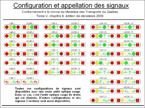
In Quebec, traffic signals have been more accessible for years: most traffic signals in the province use a Designed in Canada solution that uses shape, and the number of lamps (as well as color, for “legacy users” who arrive from out-of-province!) in order to indicate when it is safe to proceed. The red “stop” signal is square and there are two of them. The amber “caution” signal is a diamond shape. The green “go” signal remains round. As traffic signals worldwide get replaced with OLEDs, surely cities worldwide could adopt this solution.

When we go deep enough to understand the challenge and the opportunities within, and truly embrace universal design at the city level, we can recognize when we need smart technologies … and when we just need to be smarter.